Quick Answer (TL;DR)
This free PowerPoint template maps your product's value streams from request to delivery, highlighting lead time, cycle time, and waste at each stage. It gives product and operations leaders a visual plan for reducing bottlenecks and improving flow. Download the .pptx, fill in your current-state metrics, define your target-state improvements, and use it to drive process improvement conversations with engineering and leadership.
What This Template Includes
- Cover slide. Value stream name, current end-to-end lead time, target lead time, and improvement timeline.
- Instructions slide. How to map process stages, measure wait time vs. work time, and identify waste categories. Remove before presenting.
- Blank template slide. A horizontal process flow with stage boxes, time metrics (lead time, cycle time, wait time) per stage, and improvement initiative cards below each bottleneck.
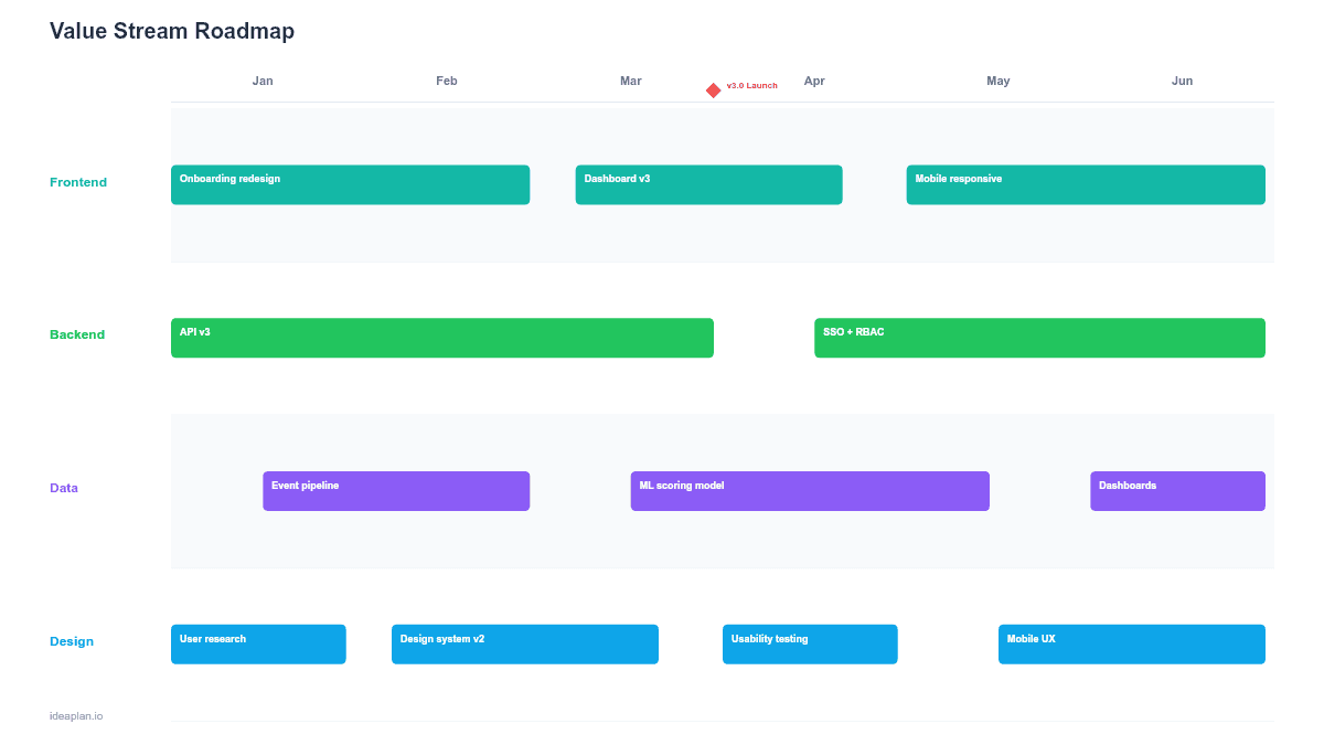
- Filled example slide. A SaaS feature delivery value stream from "Idea Captured" to "Live in Production" across 7 stages, with current-state metrics showing a 47-day lead time and improvement initiatives targeting a 22-day lead time.
Why Value Stream Mapping Matters for Product Teams
Value stream mapping originated in manufacturing, but the principles apply directly to software product delivery. Every product team has a value stream: the sequence of steps from a customer need being identified to a solution reaching users. Most teams have never measured that end-to-end flow.
The first time you map lead time from "idea captured" to "live in production," the number is usually surprising. Teams that think they ship features in 2 weeks often discover a 6-8 week lead time once you include backlog wait time, design queues, code review delays, and deployment windows. The gap between cycle time (hands-on-keyboard work) and lead time (total elapsed time) is almost entirely wait time. And wait time is where the improvement opportunities live.
A value stream roadmap makes these improvement opportunities plannable. Instead of vague commitments to "ship faster," you identify specific stages where wait time is highest and plan targeted initiatives to reduce it. This approach connects directly to deployment frequency and lead time for changes. Two of the four DORA metrics that predict engineering team performance.
Template Structure
Process Stage Boxes
Each box represents a stage in the value stream: Ideation, Prioritization, Design, Development, Review, Testing, Deployment. Below each box, three metrics appear:
- Cycle time. How long active work takes within this stage (e.g., 3 days of development work).
- Wait time. How long items sit idle before this stage begins (e.g., 5 days in the development queue).
- Lead time. Cycle time plus wait time for this stage.
Stages with a high wait-to-cycle ratio are bottlenecks. A development stage with 3 days of cycle time but 8 days of wait time means items spend 73% of their time in that stage waiting, not being worked on.
Improvement Initiative Cards
Below each bottleneck stage, initiative cards describe planned improvements:
- Initiative name. What will change (e.g., "Reduce code review queue to < 24 hours").
- Current metric. The baseline number you are improving.
- Target metric. Where you want it after the initiative ships.
- Owner. The team or person responsible.
Current State vs. Target State Summary
A summary bar at the bottom compares end-to-end current-state lead time with the target-state lead time after all initiatives are complete. This gives leadership a single number to track: "We are going from 47 days to 22 days."
How to Use This Template
1. Pick a value stream
Choose one value stream to map. "Feature delivery" is the most common starting point. Other options: bug fix delivery, customer request to response, or product discovery to validated learning. Map one stream at a time. Combining streams creates confusion.
2. Walk the process end-to-end
Interview the people who do the work at each stage. Ask: "When you receive work, how long does it typically sit before you start? How long does the active work take? Where does it go next?" Document every handoff, queue, and approval gate.
3. Measure current-state metrics
For each stage, record cycle time, wait time, and lead time. Use averages from the last 3 months. If you do not have precise data, use team estimates. Even rough numbers reveal the biggest bottlenecks. Review your sprint velocity data for cycle time baselines.
4. Identify bottlenecks
Sort stages by wait time descending. The top 2-3 stages with the highest wait time are your improvement targets. These are where the value stream is slowest, and reducing wait time here has the largest impact on end-to-end lead time.
5. Plan improvement initiatives
For each bottleneck, define 1-2 initiatives that address the root cause of the wait. Common patterns: reducing batch sizes, automating handoffs, adding capacity at the constraint, or eliminating unnecessary approval steps. Set a target metric for each initiative and assign an owner. See the product strategy guide for aligning these improvements with broader business goals.
When to Use This Template
The value stream roadmap PowerPoint template works best for:
- Engineering leadership meetings where delivery speed is a key concern and the team needs a structured improvement plan
- Process retrospectives where the team wants to move beyond anecdotal complaints about slowness and use data
- Executive presentations that need to show a concrete plan for reducing time-to-market
- Cross-team coordination where handoffs between product, design, engineering, and QA create queue delays
If your focus is on the customer's experience rather than the internal delivery process, the Customer Journey Roadmap PowerPoint template maps initiatives to lifecycle stages. For automating specific workflow bottlenecks, the Workflow Automation Roadmap PowerPoint template provides a more targeted format.
Key Takeaways
- Value stream roadmaps expose the gap between cycle time and lead time, revealing where wait time dominates.
- Most software delivery lead time is wait time, not work time. And wait time is where the biggest improvements hide.
- Three metrics per stage (cycle time, wait time, lead time) provide a clear picture of flow and bottlenecks.
- Improvement initiatives target specific bottleneck stages with measurable before-and-after metrics.
- PowerPoint format makes the value stream visible to leadership and cross-functional teams in planning and review meetings.
- Compatible with Google Slides, Keynote, and LibreOffice Impress. Upload the
.pptxto Google Drive to edit collaboratively in your browser.